



Seasonal Colour Inspiration: Building an Autumn Palette from UK Woodland Photography
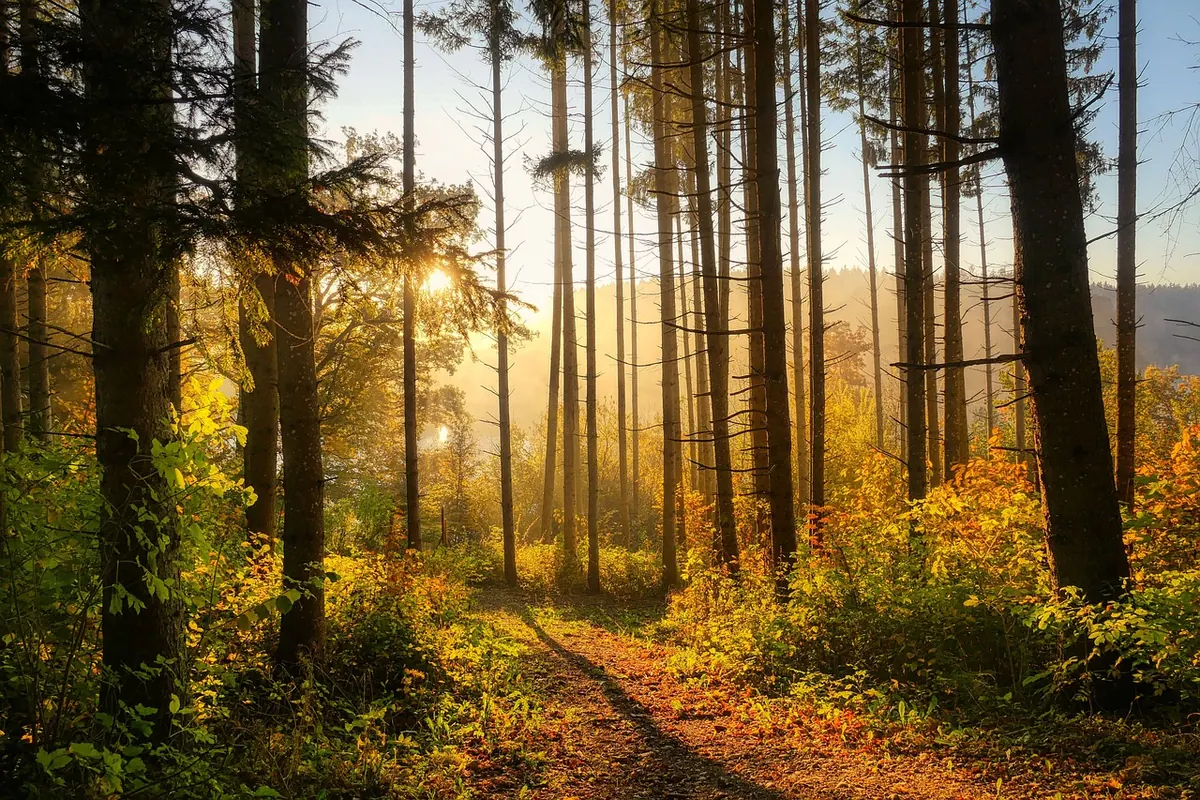
Autumn in Britain rarely arrives in one bold stroke. It seeps through beech hangers and damp oak woods over several weeks, turning bracken bronze, deepening the moss and leaving bark almost black against wet leaves. Photographing that shift is one pleasure; turning it into a colour palette you can use in a brand, a room or a poster is another. The useful trick is to treat your photographs as source material rather than pictures, and to sample them with the same discipline you would apply to a paint chart.
Why woodland photographs make a reliable starting point
Natural scenes are largely self-balancing. Everything in the frame sits under the same light, so the relationships between warm and cool, light and dark already hold together. That gives you a head start over inventing colours on a blank canvas.
The colours themselves are also more interesting than memory suggests. Woodland green is rarely the flat green of a leaf icon; it runs from olive to grey-green to a yellow-tinged moss depending on shade, lichen and damp. Bark is seldom simply brown. Beech can read as purple-grey, pine as warm tan, oak as a near-black charcoal when wet. Sampling real surfaces gives you hues you would not have thought to mix.
The four tone families worth hunting
Walk into any deciduous wood in October and you can sort almost everything into four groups. Knowing which is which keeps a palette from turning into a muddle.
- Bark and shadow. Your deep values: wet oak, slate-grey beech, the inside of a hollow trunk. These do the structural work.
- Moss and lichen. Muted greens and grey-greens, often with a surprising amount of grey in them. British moss stays green through winter, which is why it reads as calm rather than springlike.
- Ochre and bracken. The golden middle: dying fern, dried grass, beech leaves at the yellow stage. Warm, but usually lower in saturation than you expect.
- Russet and berry. The accents. Copper beech, rowan berries, the last flush of dogwood. Use sparingly, or the whole palette shouts.
Notice how close these sit to one another on the colour wheel. That family resemblance is what makes an autumn palette feel coherent.
Photograph for colour, not for the view
Overcast days are your friend here. Flat, diffuse light lets you record the true hue of a surface; hard midday sun burns out highlights and drops everything else into blue-grey shadow, and the colours you capture will be mostly guesswork. Drizzle is even better, because wet bark and leaves hold their saturation.
Get close. A wide shot of a wood is pleasant but hard to sample from, since every leaf becomes a pixel or two of mixed colour. Fill the frame with a single tree trunk, a mossy root, a drift of fallen leaves. If you want a neutral reference, include something reliably grey in the corner of a shot — a wet stone, a metal gate, gravel — so you can check your white balance later.
If you shoot JPEG on a phone, remember the camera has already edited for you, pushing saturation and contrast. That is fine, as long as you dial back the resulting swatches rather than trusting the numbers exactly.
From photograph to swatch: a sampling routine
- Open the image in any editor with an eyedropper, or a palette app that samples from a photo.
- Sample six to eight points across different materials, not six points from the same tree. Aim for at least one dark, one light and a few middles.
- Skip clipped highlights and blocked shadows. A blown white or crushed black carries almost no hue, so it will only flatten the palette.
- Write the hex values down in order, then reduce saturation by roughly ten to twenty per cent. Screens exaggerate colour, and a swatch that looks soft on a monitor will look right in print.
- Group your swatches by role: base, support, accent. Naming them after the place they came from — Bracken, Grizedale, October — makes them easier to use and remember.
- Convert the set to greyscale and check the values spread out. If four swatches all land at the same lightness, the palette will feel flat whatever the hues.
Balancing russet, ochre, moss and bark
Start with a ratio
A workable default is roughly sixty per cent base, thirty per cent support, ten per cent accent. In autumn terms: a deep bark brown or shadowed grey-green as the base, ochre and moss as the supporting tones, and russet or berry red reserved for the accent. Landscape photographers work this way instinctively — most of the frame is quiet, and one or two red leaves do all the lifting.
Watch the saturation
The most common failure is making every colour equally vivid, which produces a palette that feels like a discount leaflet. Keep one accent at full strength and pull the others back. Muted ochre beside a saturated russet looks intentional; both at maximum looks accidental.
Add one cool note
An all-warm palette built from bark, bracken and copper drifts towards brown sludge. Steal a cool from the same photograph: the blue-grey of a wet stone, the slate of a shadowed path, the pale grey-green underside of a lichen. Even a single cooler swatch gives the warm tones somewhere to sit.
Testing before you commit
Put the palette to work on something real and small. Lay out a heading, a paragraph of text and a button or call to action, then check that the text still reads clearly against its background — a contrast checker tool will tell you in seconds, and your own eye will confirm it. If you are printing, run a small swatch on the actual paper, because uncoated stock swallows warm mid-tones and will leave your ochre looking tired.
Also look at the palette at thumbnail size. Autumn colour is often subtle, and a set that looks rich on a full screen can collapse into three similar browns when it is shrunk onto a business card or a book spine.
Keeping an autumn palette that lasts
Woodland colour shifts week by week, so build the habit rather than the one-off palette. Keep a folder of photographs sorted by month, and add two or three new samples each October: the first turning beech, the last bronze bracken, moss after rain. Store the hex values in a plain text file alongside a note about the light and the location, and revisit the set each year. Within two or three seasons you will have a personal autumn range that is genuinely yours, drawn from places you have actually walked.
When you come to use it, resist adding colours from nowhere. Everything you need is already in the photograph: one dark, one light, a couple of quiet middles and a single warm accent. Sample honestly, mute slightly, and let the wood do the balancing.
Photo: fietzfotos / Pixabay